A Block in San Francisco
a digital humanities project using 1900 census data
Between Market, 7th, Stevenoson, and 8th St in San Francisco, today you can find a coffeeshop, a grocery store, a phone shop, a tobacco shop, a library, a dance studio, a theater, an office building, a few government offices, and a few non-profits. At a first sight, this block off of the busy Market St is hardly residential.
Use the Google map below to explore and see for yourself.

Photo credit: D. H. Wulzen Glass
Plate Negative Collection (Sfp 40),
San Francisco History Center,
San Francisco Public Library.
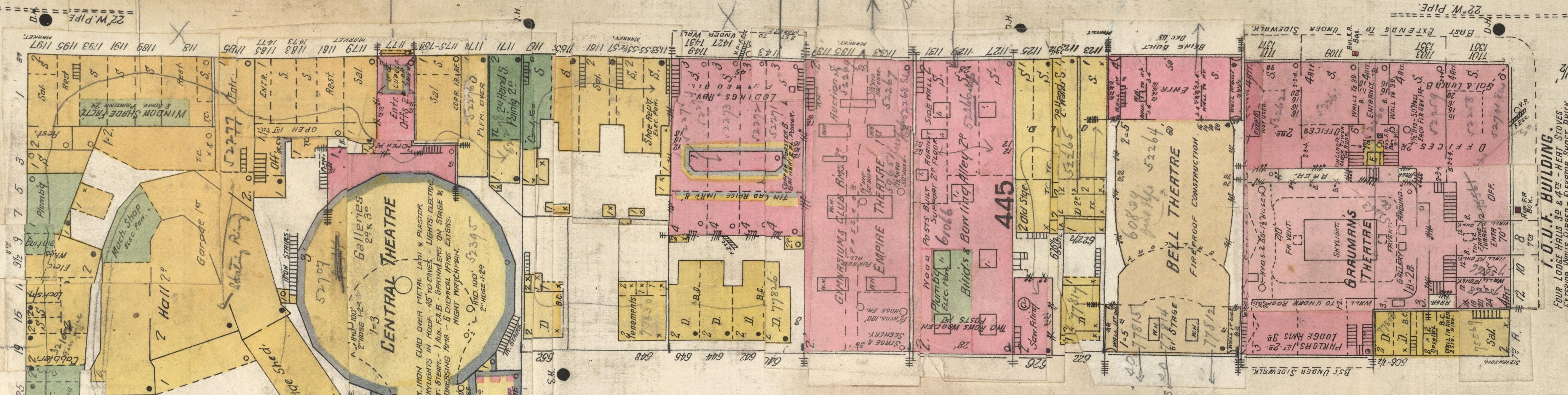
Back in 1900 the city's map looked a little differently. In 1906, following the 1906 San Francisco earthquake and fires, the city underwent reconstructions and changes. The 1905 Sanborn fire insurance maps atlas show what the street plan of the city looked like before the 1906 disaster.
Hover over the map to take a closer look and explore what the block between Market, 7th, Stevenson and 8th St was like back then.
Before San Francisco became the tech hub it is today, Market St was a bit more residential. The 1900 census data recorded at least 154 permanent residents in our block, capturing their year and place of birth among other information. The map below shows their homes. You'll notice the pins don't fully match current building or house numbers - most buildings don't even exist at all.
The pins on the map above are color-coded based on homecountry; click on any pin to learn more about the specific resident.
The map above displays the birthplaces of the residents in the block in 1900. You can adjust the time period with the slider and get information on specific dots by hovering over them.
In the 1900 census data, places of birth are recorded as countries, covering large and demographically diverse regions. The georeferencing tool used to produce these maps handles this lack of precision by placing the country in the middle — of where it is today. There are a lot of problems and workarounds to make georeferencing or at least visualization better — a cheap-and-easy solution is to use bigger markers that cover a larger area to represent the vagueness — but we cannot go beyond what is available as information. Historical sources are often incomplete and fragmented, while working with data implies pin-point accuracy.
Another issue with this visualization is that the slider implies some dynamism, while the dots remain static. This arises from a lack of information, as we only have knowledge of the residents' birthplaces and their location in July 1900. The time in between remains uncertain. Although the census contains the year of immigration to the US for some of those born outside the country, it does not capture their point of entry. We can fill in some gaps through inductive reasoning.
The 1900 census provides both explicit and implicit data about the block's inhabitants. Explicit data refers to information that is readily provided either by the census official (Archie L. Hyde), such as address, or by the individuals themselves upon inquiry, such as name, place and year of birth, occupation, etc. Implicit data is anything else that can be inferred from the data. For example, based on a resident's known month of birth, we can deduce their zodiac sign (did you notice on the map above?) Although this kind of information may not reveal much, it serves as a useful example of deductive inference from the available data.
Inductive reasoning is more likely to produce erroneous conclusions but is also potentially more enlightening when working with census data. Based on occupation and location, we can infer annual income; based on country of origin, we can infer about religious and cultural belonging; and so on.
Going back to the map above, we can track families's locations throughout the years based on their children's place and year of birth.
The map above allows you to track families' known locations prior to 1900. Use the drop down menu to choose a family and the slider to adjust the time period.
The residents living inside the block of Market, 7th, 8th and Stevennson St were a diverse (all white) group. The grouping by families aims to capture the different paths they took to reach the same block in San Francisco.
Both maps combined suggest that most residents of the block in 1900 moved to (or were born in immigrant families in) California after 1860. This coincides with the rapid population growth of San Francisco during the Gold Rush era.
The general trend of the family routes above is moving westward, meaning most likely arrived in the US crossing the Atlantic Ocean. On average, the 5000 km trip across the ocean took roughly 6-10 days. California, and the West Coast in general, was another 5000 km away - a journey that without any stops along the way could take weeks or even months.
The map above is clearly incomplete. The limited information results in very few arrows across big distances, more representative of modern-day flights rather than the long routes along roads, rivers and seaways across 19th century Europe and North America. It is possible to fill in some of the location gaps with information from other resources like censuses from different years, immigration ships passenger records, other archives, etc. Personal diaries, memoirs, family histories and others can make the narratives more human. Multilayered, interlinked data would allow us to situate immigrants' backgrounds and experiences.
You can download the filtered & scrubbed dataset (150 entries, only selected columns and intials instead of first names) used for the maps above directly from my Observable notebooks.
Find the full transcribed dataset (350 entries) here, available for Minerva University students and faculty, or upon request.
The 19th to 20th century immigration to the US is fairly well-recorded. There are many (far more extensive than mine) digitized records and archives of immigrant arrivals in the 19th century, such as:
Google & most databases require specific inquiries to retrieve data. If you don't know where to start, here are some challenges for you.